Mining the Best Cycling Roads around Bucharest with Strava

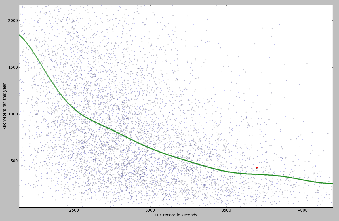
This year I tried to do a little more cycling during the week. I have a road bike, so I’m interested in quality roads – good tarmac, no potholes, enough shoulder to allow trucks to overtake me and live to talk about it. But I don’t know all roads around Bucharest. Best roads for biking are the smaller ones, with little traffic, that lead nowhere important. How can I find them?

I’ve worked on Strava data before and I saw here an opportunity to do it again. Using this simple script, I downloaded (over the course of several days) a total of 6 GB of GPS tracks. I started with the major Strava bike clubs in Bucharest, took all their members, then fetched all rides between April and the middle of June. Starting from 9 clubs, I looked over 1414 users. Only 674 have biked during the analyzed period. The average number of rides for those two and a half months was 25, with the [10, 25, 50, 75, 90]-percentile values of [2, 6, 17, 36, 64]. These are reasonable values, considering there are people that are commuting by bike (even over 20 km per day).

Ok, how can you determine the road quality from 6 GB of data? Simplest solution: take the speed every second (you already have that from Strava) and put it on a map. I did this by converting (lat, lng) pairs to (x, y) coordinates on an image. Each pixel was essentially a bucket, holding a list of speed values.

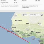
Let’s check out the area around Bucharest (high res version available here):

chart_all_small

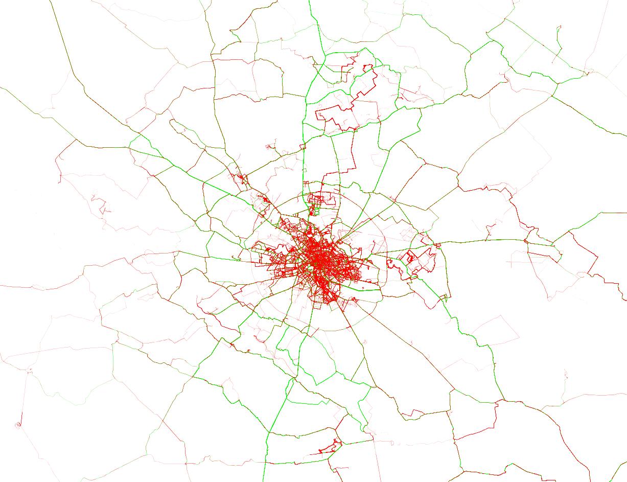
In this chart, bright green lines signal roads where there are many riders going over 35 kmph (technically speaking, the 80th percentile is at 35). On the opposite side, red roads are those where you’ll be lucky going with 25 kmph. The color intensity signals how popular a route is, with rarely used roads being barely visible. I already knew the good roads north of Bucharest, with Moara Vlasiei, Dascalu, Snagov and Izvorani. I saw on Strava that the SE ride to Galbinasi is popular, but I’ve never ridden it. From this analysis, I can see there are many good roads to the south and a couple of segments to the west. Unfortunately for me, for anything that’s not in the north I have to cross Bucharest, which is a buzzkill. Also notice the course from Prima Evadare (the jagged red line in the north) and the MTB trails in Cernica, Baneasa and Comana.

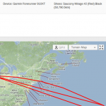
Let’s zoom in a little and see how the city looks like:

chart

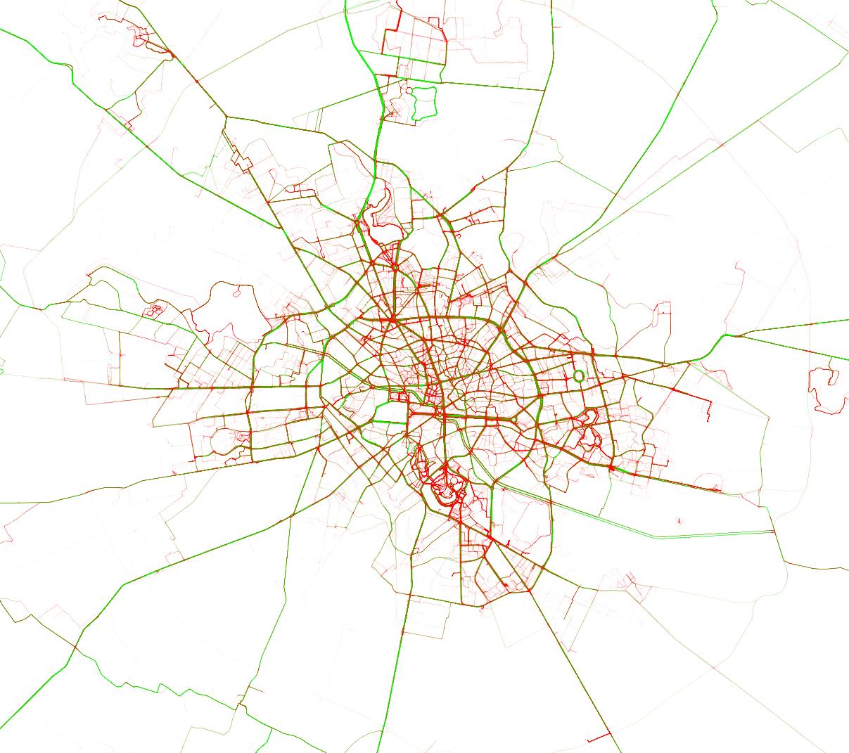
For this chart, I relaxed the colors a little, with 35 kmph for green and only 20 kmph for red. Things to notice:

  • the RedBull MoonTimeBike course in Tineretului (in red); notice that the whole of Tineretului or Herastrau are red; it means you can’t (and shouldn’t) bike fast in parks; please don’t bike fast in parks, it’s unpleasant (and dangerous) for bikers and pedestrians alike
  • the abandoned road circuit in Baneasa (in bright green)
  • National Arena in green
  • the two slopes around The People’s Palace in green (from how it’s built, all slopes will be green, which is not a problem, since Bucharest is pretty much flat)

Full code available here.

Data Mining Strava: Running for the World Record. And Beyond

I’ve been running a little more seriously this year. On Strava, I’ve registered 427km, including a few contests: EcoMarathon (14km +600m), San Francisco Marathon (41km), Golden Gate Trail Run (30km, +1200m) and Piatra Craiului Marathon (38km, +2300m). During these races I’ve noticed I’m really slow – finishing somewhere in the last 10% – 20% in my category. So the questions that emerged in my mind were:
– taking training out of the equation, am I just slower than others?
– how important is training in improving my running pace? If I trained more, how much should I expect to improve?

Analysis Procedure

I chose as reference the personal record over 10 kilometers. I would get this info about a bunch of users, along with how much they’ve run this year. I would remove users that are new to Strava – since I can’t determine if they just started running of if they just started using Strava, yet having already ran a lot.

Having this data, I would see how much the 10k time improves as an athlete trains more. I would also see how I stand compared to other having similar training and how much I can expect to improve, given more training.

Getting the Data

First off, let’s get some data out of Strava, so I have people to compare myself to. Since Strava doesn’t have a public API, I had to scrape their website. I got a list of users from a monthly running challenge. Scraping here was straightforward – the call didn’t require authentication and gave data in JSON. In the end, I had 17000 ids for active Strava users.

Then, I needed some statistics on each user. Since those statistics required authentication, I used a script that handled all that, so I could access the site from within Python. Worked a little more on getting the data out of HTML format.

After removing users that started using Strava recently, I was left with around 7000 data points. I also had to remove users having erroneous GPS tracks – appears Garmin has a bug that sometimes sends you to the point with coordinates (0, 0):

I also removed people that were very slow. If you need more than 2 hours for 10km, you’re walking. And you’re also messing up my chart.

Analysis

I put all the points on a scatter plot. I trained an SVR on them, so I could also show a pretty line (in green). You can see my record on the chart as a red point.

You can see some fishy stuff on the chart. The fishiest is the group of points very similar to the 10k World Record (26:17 or 1577 seconds). I looked over a couple of the tracks that generated those points and they seem to be mislabeled bike rides. Yet, I can’t explain why there are so many points around the world record value. Most likely a Strava bug.

There are a lot of people faster than the World Record. Some of them are going up to over 500 kmph. Mislabeled… flight?

Let’s zoom on the area with the highest concentration of points. It looks like this:
strava-chart3

What you can notice from this chart:
– if you train more, you get faster. The improvement is not linear – it takes more training to improve the better you become;
– I am indeed slower than other people with similar training.

The SVR model estimated an average runner, having the same training as me, would be 5 minutes faster. Another result from the model: I would need 867km of running in order to reach a time of 50 minutes. Hmm… seems science is telling me to move on to a new sport.

All code is available on Github.

Using Twitter psychics to predict events

There’s been a lot of buzz over the past couple of years on predicting the outcome of events based on Twitter data. Having easy access to the thoughts of millions of people worldwide, tapping into the stream of short, cryptic and mostly useless tweets and trying to make some sense out of them attracted the interest of a lot of curious people.


Jessica Chung and Erik Tjong Kim Sang tried to predict the outcome of political elections. Johan Bollen found a correlation between Twitter and the stock market. Xiaofeng Wang tried to predict crime based on tweets.


When it comes to predicting Oscar winners, Liviu lica and the guys from uberVU used overall sentiment, which worked in 2011, but failed in 2012. At the uberVU hackaton, I tried using another approach, focused on adjective, which (lucky me) seemed to work. But a new study showed that
Twitter messages are not useful when it comes to movie predictions. And I agree with them: all of the ideas above are flawed. People are noisy sensors. Aggregating over noisy sensors does not result in the right answer, just in an estimate of it (along with an uncertainty level).


But there is one way to reduce the uncertainty level down to a negligible value: use tweets from psychics. The problem with this approach is identifying “psychic” tweets. Obviously, there are very few psychics in the world, so identifying their tweets is not trivial.


I used a simple rule-based filtering approach: I picked only tweets that don’t contain a question (no ‘?’) and the author expresses certainty about who the winner will be (the phrase ‘will win’ appears in the tweet, but ‘think’ or ‘hope’ don’t).

For the proof of concept, I used the corpus from the previous hackaton – 62000 tweets recorded in one week, prior to the Oscars, each tweet assigned to the movie it’s referring. The movie “The Tree of Life” has just 2100 tweets, while “The Artist” goes up to 19200. Out of the 62000 tweets, I get only 98 after filtering. Let’s see how they are distributed:

Psychic

So there you have it – the power of psychic tweets, predicting the Oscar winner!

Disclaimer: While the data and results are real, I hope you enjoyed this April 1st prank 🙂

El Clasico on Twitter

Saturday evening – at the theatre. It was the worst play I’ve ever seen. The room was half empty (which is .. rare, to say the least). A few people around me were dozing off. Meanwhile, I was counting sleeping people or analysing the beautiful decorations. I quit trying to figure out what all the metaphors in the play meant, all I wanted were some subtitles, to translate what the actors said into concrete facts and events.

Anyway, I then remembered that El Clasico (the match between Real Madrid and Barcelona) was just a couple of hours away. I started wondering what’s the impact of this sporting event on Twitter.

As soon as I got back home, I hacked some code to monitor a few Twitter keywords (“barcelona”, “real madrid”, “el clasico”, …) and then left it running.

Next day, I checked out the “harvest”. It collected over 3000 tweets over an interval of 3h30′, ranging from 3 to almost 100 tweets per minute. I plotted the histogram and highlighted the first and second half (with grey shading) and the 4 goals (with red lines).

The histogram highlights spikes in tweets at the beginning of the match, as well as in the end of each half. A little more interesting is the behaviour after a goal – a short drop (everybody stops to see the goal) followed by a spike (after checking the replays, people tweet about it).

Elclasico

Now let’s put some keywords on the chart. Get the most frequent words (I filtered for overall count > 25). Now compute each word’s count over 5 minute windows, plus the mean and standard deviation for these counts. Going over the counts again, I plot words with a window frequency a lot higher when compared to the mean (I used (freq – mean) / st_deviation > 3.5). I set the text opacity depending on the above score. Code is available here.

The words this algorithm found are pretty good. It found 2 of the goal scorers, another player with the decisive pass, some typical end-of-the-match words, as well as the occasional spam (one hour or a few minutes before the start). Possible improvement: Normalise frequencies for each window – will check it out in a future project.

Interview with a Lady Gaga fan

A lot of people comment on youtube videos. A LOT! Lady Gaga’s Bad Romance has more than 1 million comments. What are all those people talking about? Since I’m too lazy to actually read the comments, I’m taking a different approach: I’m building a Markov Model Lady Gaga Fan Simulator (MMLGFS).

The MMLGFS will require training, taking some comments as input. After this, you are able to actually talk to it. Just provide the first 2 words and the model will output the rest of the phrase. Check out the code here.

Now that we have a virtual Lady Gaga fan, let’s ask him some questions:

Web Mining for Dummies reporter: Who are you?
Lady Gaga fan: I am… aspiring to become a succesful pokemon trainer.

WMfD: How would you describe Lady Gaga’s music?
LGf: Her music… is the best christmas gift ever.

WMfD: What’s the hidden meaning of this song?
LGf: It’s… about being in bed with another guy.

WMfD: And how do you feel about that?
LGf:I like… a few but i was apparently wrong as i caught her in all videos and tweet peoplechoiceawardsgaga.

WMfD: A lot of people think Jennifer Lopez is so much cooler. What do you think?
LGf: Jennifer Lopez… and pitbull is worse and they still wiped the floor is going to say stupid things btw is the latest dreamwork animation puss in boots.

WMfD: Thank you for this interview, mister fan, and have a nice day.
LGf: You are… going to the paradise because of this song so please support a dedicated and hungry newartist from seattle you will be funded for my mp3player anyone have suggestions like heavy metal or alternative.

Let’s try a different example (or people will say I am making fun of Lady Gaga [which I am, btw]). This time, I’m choosing lecture 1 from Stanford’s Machine Learning course, presented by Andrew Ng. Side note: Stanford announced a set of new free online courses starting January/February 2012, like Natural Language Processing or Game Theory:

Stanford

There were only about 180 comments for this model, so it’s not as advanced as the previous one. Still, it does turn out to be silly:

WMfD: Why do you follow Andrew Ng’s lectures on Youtube?
Machine Learning student: It is… a much better experience than listening to my boring professor at our university.

WMfD: Did you find the lectures useful?
MLs: I know… some people who like to learn after my day job very useful and it will even make us realize more the complexity of our mind and the power of the creator who designed it.

WMfD: What would you tell Andrew Ng if you met him?
MLs: Andrew Ng… thanks stanford for the knowledge that i ve always been wanting to learn will not give it consciousness instead it will give me an opportunity learning something valuable for free but for real.

WLfD: Thank you for your time.
MLs: You are… a terrorist.