I’ve been running a little more seriously this year. On Strava, I’ve registered 427km, including a few contests: EcoMarathon (14km +600m), San Francisco Marathon (41km), Golden Gate Trail Run (30km, +1200m) and Piatra Craiului Marathon (38km, +2300m). During these races I’ve noticed I’m really slow – finishing somewhere in the last 10% – 20% in my category. So the questions that emerged in my mind were:
– taking training out of the equation, am I just slower than others?
– how important is training in improving my running pace? If I trained more, how much should I expect to improve?
Analysis Procedure
I chose as reference the personal record over 10 kilometers. I would get this info about a bunch of users, along with how much they’ve run this year. I would remove users that are new to Strava – since I can’t determine if they just started running of if they just started using Strava, yet having already ran a lot.
Having this data, I would see how much the 10k time improves as an athlete trains more. I would also see how I stand compared to other having similar training and how much I can expect to improve, given more training.
Getting the Data
First off, let’s get some data out of Strava, so I have people to compare myself to. Since Strava doesn’t have a public API, I had to scrape their website. I got a list of users from a monthly running challenge. Scraping here was straightforward – the call didn’t require authentication and gave data in JSON. In the end, I had 17000 ids for active Strava users.
Then, I needed some statistics on each user. Since those statistics required authentication, I used a script that handled all that, so I could access the site from within Python. Worked a little more on getting the data out of HTML format.
After removing users that started using Strava recently, I was left with around 7000 data points. I also had to remove users having erroneous GPS tracks – appears Garmin has a bug that sometimes sends you to the point with coordinates (0, 0):
-
- Running across the Atlantic
-
- Running across the Atlantic.. thrice
I also removed people that were very slow. If you need more than 2 hours for 10km, you’re walking. And you’re also messing up my chart.
Analysis
I put all the points on a scatter plot. I trained an SVR on them, so I could also show a pretty line (in green). You can see my record on the chart as a red point.
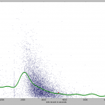
You can see some fishy stuff on the chart. The fishiest is the group of points very similar to the 10k World Record (26:17 or 1577 seconds). I looked over a couple of the tracks that generated those points and they seem to be mislabeled bike rides. Yet, I can’t explain why there are so many points around the world record value. Most likely a Strava bug.
There are a lot of people faster than the World Record. Some of them are going up to over 500 kmph. Mislabeled… flight?
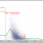
Let’s zoom on the area with the highest concentration of points. It looks like this:
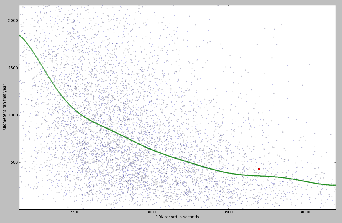
What you can notice from this chart:
– if you train more, you get faster. The improvement is not linear – it takes more training to improve the better you become;
– I am indeed slower than other people with similar training.
The SVR model estimated an average runner, having the same training as me, would be 5 minutes faster. Another result from the model: I would need 867km of running in order to reach a time of 50 minutes. Hmm… seems science is telling me to move on to a new sport.