My first Kaggle competition (and how I ranked 3rd)

1. Intro
First, a few words about Kaggle. It’s a website/community for machine learning competitions. Companies and organizations share a problem (most of the time it’s an actual real world problem), provide a dataset and offer prizes for the best performing models. Some examples of current competitions: predict customer retention, discover dark matter by how it bends light in space photos (AWESOME), predict diseases in patients based on their history (and win $3 million!) and so on.

I was planning to join a competition on Kaggle since I found out about the website (in spring, I think), but I never found the time to. And then I got an email about a new competition – to detect insults in comments. I had a little knowledge on text mining, I also had some free time, so I downloaded the dataset and started coding.

Impermium, the company behind this competition, came with some prize money. First place got $7000, while second place got $2500. Third place got just the eternal glory, yay!

For implementation, I used python, the wonderful scikit-learn library (for the SVM implementation) and the neurolab library (for the neural network implementation).

2. General System Architecture
Here I’ll briefly describe the architecture of the model that performed the best. This architecture will be expanded afterwards.

First, all texts were preprocessed. Then they were fed into 3 different classifiers: word-level SVM, character-level SVM and a dictionary-based classifier. The output from each classifier, along with some other features, were fed into a neural network.

3. Tokenizing
This step was a lot more important than I first imagined. Here are some of the things that I tried and improved (or at least seemed to) the model score:
– removing links, html entities and html code
– formatting whitespaces (removing duplicates, removing newlines and tabs)
– removing non-ascii characters (I didn’t think people curse using special characters; I would reconsider this decision, given more time)
– adding special tokens in texts for character groups such as: #$%#$ (some people curse like this), ?!???, !!!!!!
– removing repeated letters: coooool -> cool, niiiice -> niice (yes, this is not the best implementation, but it usually works)
– replacing smileys by 2 tokens, one for positive smileys and one for negative smileys (“saddies”?)
– removing dots inside words (some people put dots inside curse words – they’re not getting away with this!)
– grouping together sequences of one-letter words – like “f u c k” (some people split a curse word in letters – they’re not getting away with it!)
– trying to group consecutive words (like “fu ck”) using a dictionary (some people split curse words in 2 – they’re not getting away with it!)

4. Classifiers
The first classifier was an SVM on word ngrams, with n from 1 to 4. Not a lot can be said here, I just imported it, fed it the ngrams generated from the tokenized text and let scikit-learn do its stuff.

The second classifier was another SVM, this time on character ngrams, with n from 4 to 10.

The third classifier was a custom build dictionary based classifier. It used a curse words dictionary (which I found online and then enriched with words I found in the misclassified examples). This classifier just looked if the text had words from the dictionary and also words like “you”, “your”, “yourself” (which you use when cursing somebody). It then computed a simple score based on the distances between the curse words and the “you”-words.

The final classifier was used to combine the previous ones. I used a neural network, but I’m sure other techniques can be applied here. The network had a hidden layer of 3 neurons and was trained using the function “train_rprop” (from the neurolab library). I took advantage of the network’s flexibility and added some more features as inputs:
– the ratio of curse words
– the text length
– the ratio of *, ! or ?
– the ratio of capital letter (should have used words in all caps instead)

5. Epilogue
I used k-folds cross-validation for model selection (scikit-learn comes with some nifty tools here also).

In total, I worked around one week for this. I tried a lot more models and approaches, but what I’ve showed here got the best score. I’d love to share the code, but it’s written so crappily (due to some hard core time constraints) that I’m too ashamed to release it. Still, if anybody wants it, please contact me – I’ll share it after explicitly agreeing to one condition: Don’t make fun of it. Screw that, code available here.

I think 3rd place is a very good result (considering it’s my first competition ever). Still, I noticed that there were a lot of mislabeled examples (perhaps more than the 1% stated on the contest page). This might have had an influence on the final ranking (the difference between the winner’s score and the fifth score was less than 1%).

Yet again, I always say “Fortune favors the brave” (I don’t believe in luck). Jumping to some actionable information, light bending dark matter detection sounds pretty cool!
My talk at SYNASC 2012

It’s been quite a while since my last post here. It doesn’t mean I’ve forgotten about this place, just that I’ve had quite an intense summer (“work hard, play hard”). Now I’m excited to see the first results of my work: this week I’ll be at SYNASC 2012, in Timisoara, presenting my paper on summarizing microblogging streams. Here are the slides:

Using Twitter psychics to predict events

There’s been a lot of buzz over the past couple of years on predicting the outcome of events based on Twitter data. Having easy access to the thoughts of millions of people worldwide, tapping into the stream of short, cryptic and mostly useless tweets and trying to make some sense out of them attracted the interest of a lot of curious people.


Jessica Chung and Erik Tjong Kim Sang tried to predict the outcome of political elections. Johan Bollen found a correlation between Twitter and the stock market. Xiaofeng Wang tried to predict crime based on tweets.


When it comes to predicting Oscar winners, Liviu lica and the guys from uberVU used overall sentiment, which worked in 2011, but failed in 2012. At the uberVU hackaton, I tried using another approach, focused on adjective, which (lucky me) seemed to work. But a new study showed that
Twitter messages are not useful when it comes to movie predictions. And I agree with them: all of the ideas above are flawed. People are noisy sensors. Aggregating over noisy sensors does not result in the right answer, just in an estimate of it (along with an uncertainty level).


But there is one way to reduce the uncertainty level down to a negligible value: use tweets from psychics. The problem with this approach is identifying “psychic” tweets. Obviously, there are very few psychics in the world, so identifying their tweets is not trivial.


I used a simple rule-based filtering approach: I picked only tweets that don’t contain a question (no ‘?’) and the author expresses certainty about who the winner will be (the phrase ‘will win’ appears in the tweet, but ‘think’ or ‘hope’ don’t).

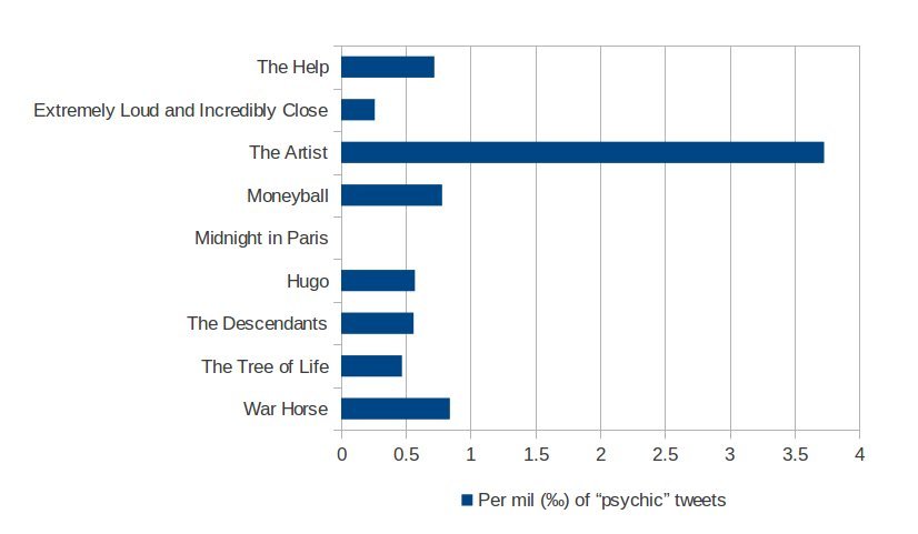
For the proof of concept, I used the corpus from the previous hackaton – 62000 tweets recorded in one week, prior to the Oscars, each tweet assigned to the movie it’s referring. The movie “The Tree of Life” has just 2100 tweets, while “The Artist” goes up to 19200. Out of the 62000 tweets, I get only 98 after filtering. Let’s see how they are distributed:

Psychic

So there you have it – the power of psychic tweets, predicting the Oscar winner!

Disclaimer: While the data and results are real, I hope you enjoyed this April 1st prank 🙂

The story of the Oscar predictions

Yesterday was uberVU’s third hackaton. Talking with one of the organizers, I found out that the guys there were planning to create an infographic about predicting the Oscar winners. UberVU.com was already tracking the volume of tweets and the sentiment for the nominees, so all the data was available.

Hmm, but can we make the infographic better? I thought about the movie posters and how they include captions from reviews, like “A shock-a-minute masterpiece” from here. Could I get such stuff out of tweets and include it in the infographic?

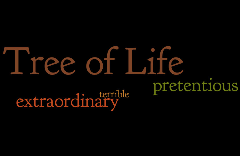
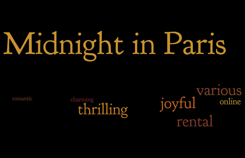
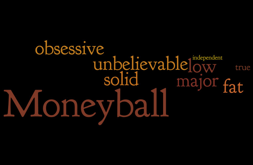
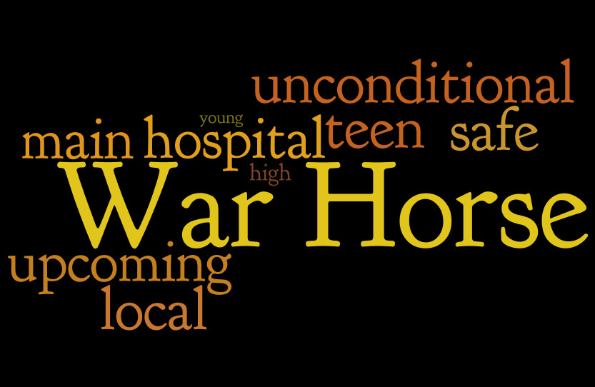
Well, let’s try. I started writing some code to get frequent captions out of tweets, but there were too many noisy expressions that would require some advanced filtering. I decided to stick just to words and finally just to adjectives. The approach is inspired by a post on Edwin Chen’s blog.

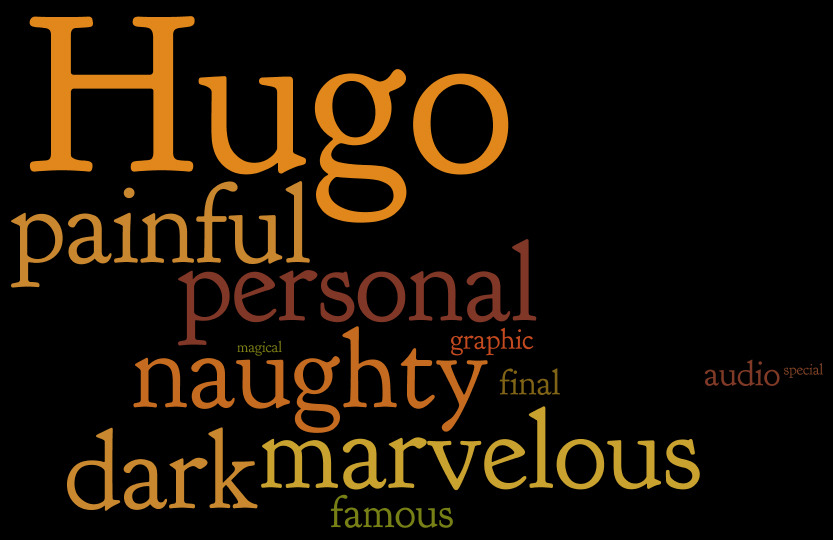
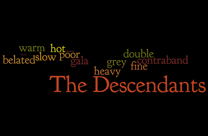
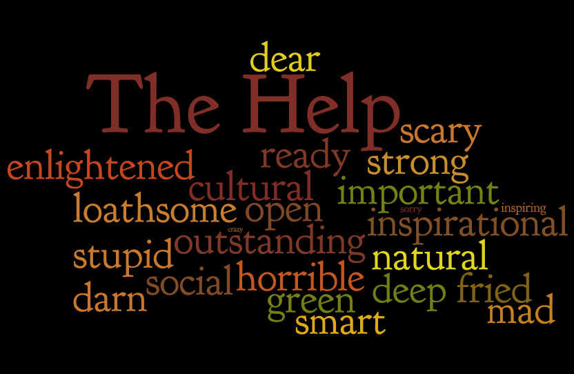
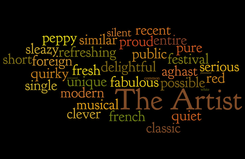
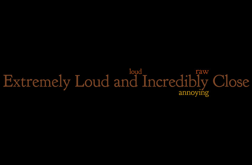
Unfortunately, the guys I hoped would help me with the infographic didn’t come. I’m not very good in Photoshop (I know how to crop and stuff, but an infographic requires a little more skill). So I decided to just build a tagcloud using wordle.net.

I sorted the movies by the number of adjectives they attracted. If the movies are ranked based on how many emotions they determine in their viewers, then this would be the final ranking (from last to first):

1_loud2_tree3_midnight4_moneyball5_warhorse6_hugo7_descendants8_help9_artist

The code is available on github.

Update: The guys from uberVU have created the infographic, inserting some of the stuff above, and they have posted it on Techcrunch. They used sentiment data to predict the winner (choosing “The Help”). In the end, the winner chosen by the jury proved to be “The Artist”.

El Clasico on Twitter

Saturday evening – at the theatre. It was the worst play I’ve ever seen. The room was half empty (which is .. rare, to say the least). A few people around me were dozing off. Meanwhile, I was counting sleeping people or analysing the beautiful decorations. I quit trying to figure out what all the metaphors in the play meant, all I wanted were some subtitles, to translate what the actors said into concrete facts and events.

Anyway, I then remembered that El Clasico (the match between Real Madrid and Barcelona) was just a couple of hours away. I started wondering what’s the impact of this sporting event on Twitter.

As soon as I got back home, I hacked some code to monitor a few Twitter keywords (“barcelona”, “real madrid”, “el clasico”, …) and then left it running.

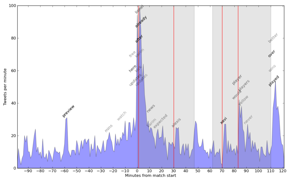
Next day, I checked out the “harvest”. It collected over 3000 tweets over an interval of 3h30′, ranging from 3 to almost 100 tweets per minute. I plotted the histogram and highlighted the first and second half (with grey shading) and the 4 goals (with red lines).

The histogram highlights spikes in tweets at the beginning of the match, as well as in the end of each half. A little more interesting is the behaviour after a goal – a short drop (everybody stops to see the goal) followed by a spike (after checking the replays, people tweet about it).

Elclasico

Now let’s put some keywords on the chart. Get the most frequent words (I filtered for overall count > 25). Now compute each word’s count over 5 minute windows, plus the mean and standard deviation for these counts. Going over the counts again, I plot words with a window frequency a lot higher when compared to the mean (I used (freq – mean) / st_deviation > 3.5). I set the text opacity depending on the above score. Code is available here.

The words this algorithm found are pretty good. It found 2 of the goal scorers, another player with the decisive pass, some typical end-of-the-match words, as well as the occasional spam (one hour or a few minutes before the start). Possible improvement: Normalise frequencies for each window – will check it out in a future project.